In recent years, sales teams have been struggling to find new clients and get high-quality referrals. Of course, part of this challenge can be chalked up to past and current economic situations. However, there are a variety of other reasons that could be affecting their success. On the marketing front, these can include a lack of brand awareness, long sales cycles, and having to take time to filter out unqualified leads.
One simple way many brands use to vet potential clients and garner qualified leads is through well-crafted landing pages backed by a solid digital strategy. This allows them to leverage landing pages in a manner that maximizes conversion rates and engagement.
Know the Difference Between Landing Pages & Website Pages
Landing pages and website pages serve different purposes and have differing characteristics. For example:
- Purpose: Unlike webpages, landing pages are standalone deliverables meant solely to convert visitors to leads.
- Content: Website pages serve to educate the reader about broad topics or provide insight into a business. They can often contain well over 600 words. Landing pages are short, concise, usually focused on one product or service, and structured to capture leads through form fills. They are meant to help the user understand the service, product, or offer within a few seconds.
- Design: Webpages have a variety of visual elements like images, videos, and interactive features to engage visitors. Landing pages are designed to draw attention to the offer and the CTA.
- Traffic source: Visitors can reach webpages through a variety of sources, such as organic traffic, referrals, and direct URLs. However, landing pages are usually associated with paid media campaigns, social ads, or email marketing.
| Webpage | Landing Page | |
|---|---|---|
| Purpose | Build awareness and provide information | Convert visitors to leads |
| Content | Often lengthy and broad in scope | Short, concise, and focused on one product, service, or offer |
| Design | Designed to move users through the website and end on a CTA | Designed to draw attention to the CTA |
| Traffic Source | Organic, referral, direct | Paid media, social advertising, email marketing |
When to Use Landing Pages
A dedicated landing page focuses on key conversions for the campaigns you’re running and aligns with the audiences you want to reach. Simply put, using a landing page streamlines the lead generation process, and allows the visitor an efficient path to convert.
2 First Steps to Effective Landing Pages
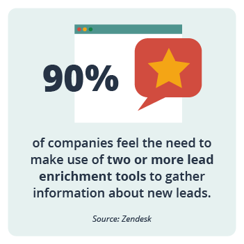
By providing high-level information and a clear call to action you not only create a better user experience but also help to weed out unqualified leads.
 1) Incorporate Your USP into Landing Page Design & Content
A USP (Unique Selling Proposition) is a critical element of a landing page. It should be strategically placed to capture the attention of your visitors and differentiate your offerings from those of competitors. A USP can be added to a landing page’s headline, subheadline, CTA, visual elements, and more. You want to avoid jargon and focus on the benefits that matter most to your audience. By strategically placing your USP throughout the landing page, you can maximize its impact and increase the likelihood of conversions.
2) Follow the AIDA Framework
AIDA (Attention, Interest, Desire, Action) is a simple process to follow when you want to guide potential customers to take a specific action.
- Attention: Grab the visitor’s attention with eye-catching visuals and relevant headlines that resonate.
- Interest: Get visitors interested in learning more. Highlight how your products and services solve your target audience’s pain points.
- Desire: Use testimonials, social proof, and more to demonstrate how your products and services have fulfilled your audience’s desires or solved their problems.
- Action: Create a clear, prominent, and compelling CTA that aligns with your goal. (E.g. sign up, download, etc.)
How to Design a Landing Page That Converts
Careful planning and following design best practices will help you create an effective landing page.
Design your page with the following in mind:
- User Interface (UI): Create a seamless experience that makes it easy for users to interact with the page.
- Form Fields: Utilize user experience (UX) best practices to create a form field that converts. The number of form fields and their labels should be concise and easily understood. The lead form must be above the fold.
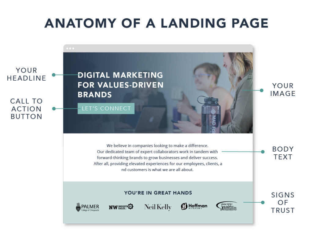
- One Call-to-Action (CTA): Use only one CTA. Multiple calls to action will confuse users, as the landing page should be geared toward one action. (E.g. sign up, contact us, schedule an appointment, etc.)
- Visual Hierarchy: A clear visual hierarchy will guide visitors to the main content and CTA. Font size, colors, and other design elements should be utilized strategically.
- Whitespace: Don’t be afraid of whitespace! This can improve readability as well as draw readers to other important elements on the page. Whitespace also allows our eyes to rest, and not work as hard to process information.
- Eye-Catching Imagery: Your images must be relevant, high-quality, resonate with your audience, and support the page’s message.
- Mobile: Be sure to hide sections that are not needed to improve the mobile experience. Also, it’s best to move the form higher up on the page.
- A/B Testing: We always recommend A/B testing to compare design elements, layouts, headlines, and CTAs. The data will help you refine and optimize your landing page.
Always Track Results
All form fields should have hidden fields for UTMs or other trackable variables contained in the URL that can be pushed into a CRM. When examining results from your A/B testing, review the following:
Page Traffic
We like to see a minimum of a few hundred visitors per page before making any decisions. For any test, the length of time it should run depends on the number of visitors being sent to the page.
Conversion Rates
Once the page has a good sample of visitors, take a look at the difference in conversions. Avoid changing your design elements until you have a large enough sample set of interactions with the page.
Length of Test
In some cases, it could take anywhere from 30 to 90 days to see enough of a difference in conversions to make any decisions. This is especially true if the key conversion rate is lower than 3%. If you are seeing a lower-than-expected conversion rate, it’s a great time to pull your marketing team together and collaborate to see if adjustments need to be made on the campaign side to improve the quality of visitor traffic to the page.
What to A/B Test
- Headlines: We always recommend testing the headline first.
- Page Layout: Using heatmapping tools, you can move sections further up the page if they have more engagement.
- Form Field: Consider changing up the look of the form. This could include the color of the form and the CTA button.
- Visuals: Try different types of visuals. Perhaps your audience responds differently to image themes, such as people versus designed visuals.
How to Use Content Marketing With Landing Pages
Behind every good landing page is a designer and content strategist. Your content team knows your personas and can speak to them clearly, concisely, and persuasively.
Here’s how to get started on content that can help drive conversions:
Be Relevant: Odds are, your paid ads, social ads, or email marketing are driving visitors to your landing page. Be sure the copy on the page contains keywords and phrases that match the campaign initiative.
Show Value: You know your audience personas, what needs they have, and how your company’s product or service can help them. Share that information in a succinct way.
Write Impactfully: It’s all about information hierarchy. Your headline needs to be attention-grabbing and concisely explain the value proposition. Don’t be afraid of using bullet points! These are easily readable and understandable.
Be Persuasive: Put your audience’s needs first. A large block of content about your company belongs on a webpage, not a landing page.
Build Trust: Testimonials, reviews, awards, and recognitions go a long way to building trust with your audience.
Seal the Deal: Think beyond the “Contact Us” CTA. What would make you take the time to fill out a form? Consider “Get Results,” “Download the Resource,” or “Register for Our Free Webinar.”
Landing Page Design Examples to Inspire Your Own
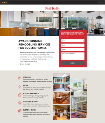
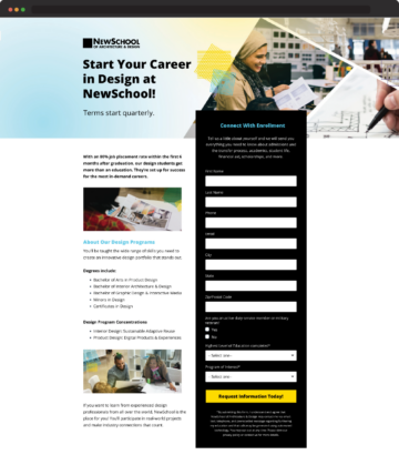
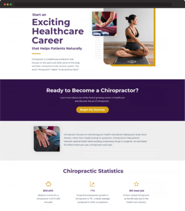
Check out these designs by Mad Fish Digital for inspiration.
Connect With Us Today for Your Design & Content Marketing Service Needs
Ready to level up your marketing?
Our team of digital marketing experts helps brands and businesses alike drive growth across all digital channels. This means our team has the experience and expertise to answer just about any question you might have. Partnering with Mad Fish Digital means you have a dedicated team of marketers working on your behalf and providing complete transparency and results.
Click here to connect with our team and learn more.


