Many web sites are created by graphic designers. They often have fantastic imagery, sexy menus, and lots of graphic flair. However, few sites achieve the goal of converting traffic into buyers and making money online.
Recently, we completed a redesign of JohnHersey.com. John is a award winning public speaker and motivational coach, but his website was having trouble conveying his story. We redesigned the site from a marketing perspective and used a few simple ideas to help him convert traffic into customers. I think this is also a great example of how you can use a small site and simple graphic principles to achieve the specific goal of moving prospects towards a next step.

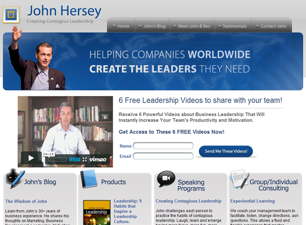
As you can see, John’s new site is pretty simple. It has a small menu of five choices on the top. Remember, choice is a burden online. The fewer choices you customers have to make, the more likely they are to make the right choice. John’s business is to sell his services as a consultant and a public speaker. The most valuable selling point is John’s winning personality. Therefore, the most prominent portion of the website is a large video of John right at eye level with an offer to receive additional videos. The entire site is designed around the goal of getting people to A) watch the brief video and B) trade their email address for additional (free) videos of John demonstrating his skills. These videos are sent to prospects in a drip campaign allowing for additional marketing over time.
You don’t need a really complicated website to achieve those two goals. In fact, we could further simplify the site to be just a video and a special offer. An ultra simple version like that could serve as a landing page for a pay per click campaign, for example. But we want to accomplish a few other tasks with John’s site without overwhelming the audience and detracting from the main goal of the site.
![]()
There are a four other goals we want to tackle on the home page. All four are equally important, but we don’t want any of them to detract from the main goal of downloading free videos. We used icons to help people quickly identify what each item represents and easily scanned language to help prospects make a quick decision about clicking through to the page.
1. John writes a great blog about leadership, courage, sales and other exciting topics. We want to highlight John’s blog on the home page, and allow people to scan quickly and decide if they want to read more.
2. John has a few well designed products. We want prospects to identify that A) John has products for sale and B) identify if any of John’s products are of interest.
3. Speaking programs. We want to highlight that John’s business is about public speaking and allow prospects to scan and decide if they want to learn more about his speaking programs.
4. John also runs a consulting business and would like prospects to understand quickly what his consulting business does and decide to click through to the page if they are interested.
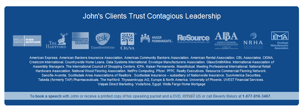
We use the bottom portion of John’s site to highlight some of his major clients for credibility. Credibility is a huge factor in helping prospects decide to take the next step. If clients aren’t already persuaded by John’s videos, blog, and testimonial page, identifying some of his major clients can help tip prospects into taking the next step.

A home page is always a balance between goals and information. The less information you have, the easier it is for your prospects to take the next step, but too little information may prevent them moving forward. Take some time to think more about the goals of your site and how you can use some minor graphic tweaks or a simple redesign to help your prospects convert to customers.


